Saturday, 23 April 2011

QUESTIONNAIRE

After doing a test screening of our film, we asked the audience to answer the questionnaire shown below. The copy of the film we exhibited was not the final edit, and the feedback gave us the information we needed to add the finalising touches to the film.


Here are a selection of quotes from the audience feedback we had:

- The second piece of music we used was too depressing and affected the humour of the film.
- The dream sequence is not very distinguishable from the real sequence. (An effect could be used).
- The volume of some of the dialogue needs to be increased.

The main piece of feedback we received was that the music was to overbearing in the real sequence.

FINAL MAGAZINE REVIEW

Here is the final magazine review in which we followed the design and layout of the reviews we found whilst researching other magazine reviews. We feel it is both informative and gives a flavour of what to expect.

MAGAZINE REVIEW, DRAFT 1

To create this magazine review, we used indesign, which helped with the layout and design. Indesign simplified the process of making the review, by allowing us to assemble the columns and images with ease.


MAGAZINE REVIEW ANALYSIS

During class Franklin analysed both of the magazine reviews, looking at the layout, language, content, etc, to help with ideas for our review.

MAGAZINE REVIEW RESEARCH

While researching magazine articles, we used the magazines 'Sight & Sound' and 'Empire' as sources for the type of layout, content, fonts, colours and language we should use for our magazine review. Here are some examples of the reviews that influenced our decisions.


DVD DISC DESIGN

This is what will be printed on the cover of each DVD disc, we used the same colour scheme as we used on the poster and power point presentation, we've tried to use synergy throughout our work using the same fonts and colours where possible.

FINAL POSTER


One of my roles was to create the poster for Dick's Day, i created the poster on photoshop, and after looking at the research we assembled and then using the audience feedback, we had the idea this was the final outcome, i think it suits the genre of the film and also follows the conventions of the posters we researched of the teen comedy genre.

POSTER DRAFT 3


Here is a design of our poster, it was constructed using images from google images on photoshop.

POSTER DRAFT 2


Above is a fairly good draft of the type of poster we want to achieve.

POSTER DRAFT 1


Above is a very rough draft of our potential poster design.

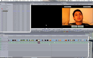
FINAL CUT PRO

Final Cut Pro is the software we used for editing the pictures. We toyed with the idea of using imovie, but as we had past experience in using final cut pro we decided to use it. it was easy for us to use because we had past experience in it from the coursework from last year.


SOUNDTRACK PRO

Soundtrack Pro was easy for us to use. Charley and Petros had past experience using Soundtrack Pro so we were familiar with the software which meant editing the sound was easy to do.


MUSIC


We found a cover for the Noah and the Whale song which has enabled us to avoid the copyright issue we would have had, had we used the original song. The song by Mika was covered by Charley Lebetkin which has also helped us to avoid the copyright issue. The software we used to make a cover of these songs was Logic Pro.

PLANNING: Call sheet and week shooting plan

Below is the call sheet which was given to each member of our group, it has been key to our groups organisation.


Below is the shooting outline for the week that we originally planned to shoot in during school. it tells us which days we planned to shoot which scenes. This helped us to organise ourselves for our timing and also the characters and props we needed for which days.

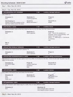
PLANNING: Scheduling and Scene Summary

Here is a list of the lessons we would miss during the filming of Dicks Day.


We created the shooting schedule and scene summary shown below on CELTX, these were given to each member of our group so we would know what scenes will be shot on which days.


UPDATED SHOTLISTS


STORYBOARD

Click HERE to view an animatic of our storyboard.

Monday, 4 April 2011

RESEARCH IN TO POSTER DESIGN


Here are a selection of posters we looked at that influenced some of the design for our poster.